How to Effectively Use Data Visualization in Financial Services Marketing?
To effectively use data visualization in financial services marketing, craft clear visual narratives to convey insights sharply. Use tools like bar charts, line graphs, and interactive dashboards to showcase trends smartly. Implement best practices such as interactive elements for deeper understanding and impactful communication. Visualize customer data for tailored services and improved satisfaction. Enhance marketing campaigns with personalized visuals that boost engagement and conversions. Measure ROI by tracking key performance metrics post-implementation. Leveraging data visualization in financial services marketing could be the key to implementing impactful strategies and resonating with your audience effectively.
Key Takeaways
- Choose appropriate visualization techniques for financial data representation.
- Implement interactive dashboards for real-time insights and user engagement.
- Utilize data visualization tools to analyze customer segmentation and behavior.
- Enhance marketing campaigns with visual impact and personalized storytelling.
- Measure ROI by tracking performance metrics like customer engagement and conversion rates.
Importance of Data Visualization
Data visualization plays an essential role in enabling financial services marketers to efficiently communicate complex data insights to clients and stakeholders. Through data interpretation and visual storytelling, marketers can transform raw data into meaningful narratives that resonate with their audience. Data representation is pivotal in conveying information effectively, allowing for better decision-making and strategic planning within the financial sector. By utilizing information design principles, marketers can create visually engaging and easy-to-understand graphics that simplify intricate financial concepts.
Visual storytelling through data visualization enables marketers to present trends, patterns, and key metrics in a clear and compelling manner. This approach not only enhances the understanding of complex financial data but also fosters engagement and retention among clients and stakeholders. Effective data visualization empowers marketers to deliver impactful presentations that drive discussions, inspire action, and build trust with their audience. By mastering the art of visual storytelling and information design, financial services marketers can elevate their communication strategies and stay ahead in a competitive landscape.
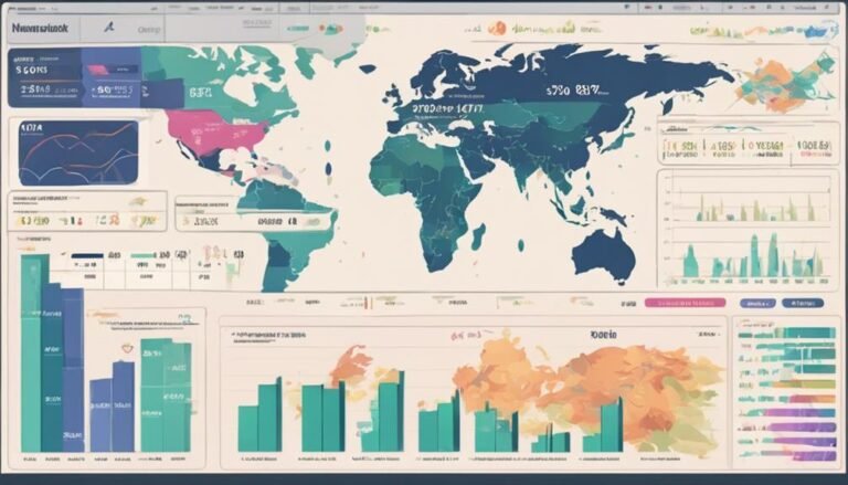
Types of Data Visualization Tools
Utilize a diverse array of visualization tools to enhance the presentation and interpretation of financial insights and trends. In the domain of data analysis within financial services, the selection of appropriate visualization tools is vital for effective communication and decision-making. Bar charts, line graphs, pie charts, and heat maps are just a few examples of visualization tools that can be employed to represent complex financial data in a digestible format. Each type of visualization tool offers a distinct way of displaying information, allowing for a thorough understanding of intricate datasets.
Interactive dashboards and infographics are also powerful visualization tools that enable users to interact with the data, uncovering insights and trends that mightn't be immediately apparent. These tools facilitate dynamic exploration of financial information, fostering a deeper understanding of the underlying data patterns. By leveraging a combination of different visualization tools, financial services professionals can enhance their data analysis processes, leading to more informed decision-making and strategic planning.
Best Practices for Data Visualization
When aiming to visualize financial trends effectively, consider utilizing interactive dashboards to engage your audience and convey complex data in an easily digestible format.
By incorporating interactive elements, you can allow users to explore the data further, fostering a deeper understanding of the financial information presented.
Implementing best practices in data visualization can enhance the communication of financial insights and support informed decision-making in the financial services sector.
Visualizing Financial Trends
To effectively convey financial trends through data visualization, it's essential to select the most appropriate visualization techniques that clearly communicate complex information at a glance.
When visualizing financial trends, utilizing graphical representations for financial forecasting and market analysis is paramount. Line charts are effective for showing the trajectory of financial data over time, while bar graphs can help compare different financial metrics. Pie charts are useful for illustrating the composition of a whole in percentages. Scatter plots can be beneficial for identifying correlations between variables.
Choosing the right visualization method based on the type of financial trend being analyzed is key to creating impactful visual representations that aid in decision-making processes and enhance overall understanding of complex financial data.
Interactive Dashboards
For a dynamic and user-friendly approach to presenting financial data, consider implementing interactive dashboards as they offer real-time insights and enhance the visualization experience.
Interactive dashboards provide a seamless user experience by allowing individuals to explore data in a personalized manner. They promote data exploration through features like drill-down capabilities, filter options, and customizable views.
These dashboards enable users to investigate further into specific metrics, compare data points effortlessly, and derive actionable insights swiftly. Enhancing user engagement and facilitating data exploration are key benefits of incorporating interactive dashboards into financial services marketing strategies.
Using Data Visualization for Customer Insights
Data visualization plays an essential role in extracting valuable customer insights for financial services marketing strategies. By utilizing data visualization tools, such as charts and graphs, you can effectively analyze customer segmentation and trends. Customer segmentation allows you to categorize clients based on various criteria, enabling personalized marketing approaches. Through predictive analytics, you can forecast customer behavior and preferences, aiding in the development of targeted campaigns.
Visual representations of customer data provide a clear understanding of demographics, purchasing habits, and interactions with your financial services. These insights help in tailoring services to meet specific customer needs, ultimately improving customer satisfaction and retention rates. By visualizing data related to customer feedback and engagement, you can promptly address issues and enhance overall customer experience.
Enhancing Marketing Campaigns With Data Visualization
When enhancing marketing campaigns with data visualization, you can harness the visual impact to captivate your audience instantly.
Utilizing data-driven strategies allows for targeted and personalized marketing approaches that resonate with potential customers.
Engaging your audience through visualization creates a compelling narrative that drives interest and boosts conversion rates.
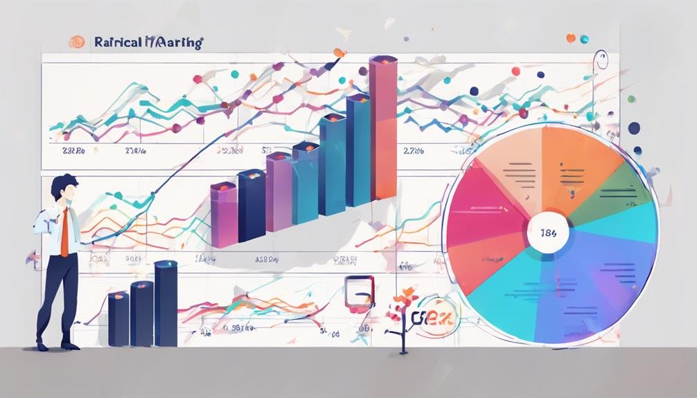
Visual Impact in Marketing
Enhance your marketing campaigns with the powerful impact of data visualization techniques. Utilizing color psychology and branding strategies can help evoke specific emotions in your audience, making your message more memorable and impactful.
Incorporating storytelling elements into your visualizations can create a deeper connection with potential clients, enhancing engagement and retention rates.
By aligning your data visualization with the emotions you want to evoke and the brand identity you aim to promote, you can effectively communicate your message and differentiate your financial services in a crowded market. Remember, a well-crafted visual representation can speak volumes and leave a lasting impression on your target audience.
- Utilize color psychology and branding to evoke emotions.
- Incorporate storytelling elements for a deeper connection.
- Align visualizations with emotions and brand identity for effective communication.
Data-Driven Strategies
Implementing data visualization techniques can greatly enhance the effectiveness of your financial services marketing campaigns. By utilizing data analysis strategies, you can uncover valuable insights that inform your marketing decisions and drive better results. Here are some key data visualization techniques and their benefits:
| Data Visualization Technique | Description | Benefits |
|---|---|---|
| Infographics | Visual representation of complex data | Simplifies information for easy understanding |
| Dashboards | Interactive display of real-time data | Enables quick decision-making |
| Heatmaps | Color-coded visualizations of data patterns | Identifies trends and outliers effectively |
Integrating these techniques into your marketing campaigns can help you convey information more persuasively and engage your audience on a deeper level.
Engagement Through Visualization
To elevate the effectiveness of your financial services marketing campaigns, incorporating data visualization techniques can greatly enhance audience engagement and comprehension.
When focusing on engagement through visualization, consider the following:
- Interactive Dashboards: Create dynamic visuals that allow customers to explore data on their own, increasing engagement.
- Infographics: Condense complex financial information into visually appealing graphics for easy understanding.
- Personalized Reports: Tailor data visualization to individual customer preferences, enhancing storytelling through data.
Measuring ROI of Data Visualization in Marketing
Measuring the return on investment (ROI) of data visualization in marketing requires a strategic approach to quantifying the impact of visual data representation on financial services outcomes. To measure effectiveness, data analysis plays an essential role. By tracking performance metrics before and after implementing visualization techniques, you can assess the impact on key performance indicators such as customer engagement, conversion rates, and revenue generation. Through data analysis, you can attribute changes in these metrics to the use of data visualization, providing insights into the ROI of your marketing efforts.
Effective ROI measurement involves setting clear objectives at the outset, aligning them with visualization strategies, and continuously monitoring and analyzing the results. By establishing a baseline for comparison and using advanced analytics tools to interpret the data, you can gauge the success of your data visualization initiatives. This strategic approach not only helps in understanding the direct impact of visualization on marketing outcomes but also enables you to make data-driven decisions to optimize your marketing strategies for greater ROI.
Conclusion
To sum up, harnessing the power of data visualization in financial services marketing can lead to profound insights and improved ROI. By utilizing the right tools and best practices, you can effectively communicate complex information to your audience.
Remember, visualization is essential for engaging customers and creating compelling campaigns. Don't underestimate the impact of data visualization in transforming your marketing strategies and driving success.
Master the art of visualization and watch your marketing efforts flourish!