What Are Some Common Mistakes To Avoid In Booth Design?
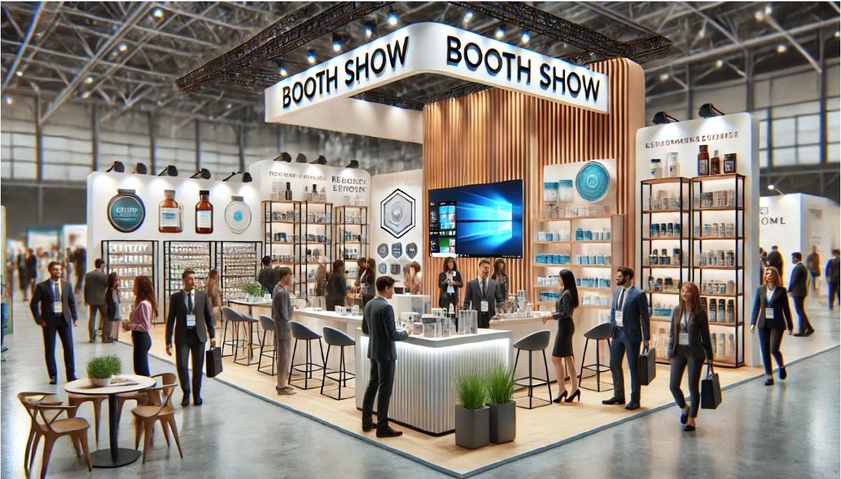
Designing an eye-catching booth for trade shows is crucial for attracting potential customers and standing out from competitors. A well-designed booth can draw in crowds, create memorable impressions, and significantly impact your brand’s visibility. However, several common mistakes can hinder the effectiveness of your booth.
Here are seven mistakes to avoid to ensure your booth design succeeds.
1. Lack of Clear Objectives
One of the most common mistakes is not having clear objectives for your booth. Without a defined goal, your booth may lack focus and fail to convey your message effectively. Determine whether you aim to generate leads, showcase new products, or increase brand awareness. A clear goal will guide your design decisions and ensure your booth achieves its intended purpose.
2. Poor Layout and Traffic Flow
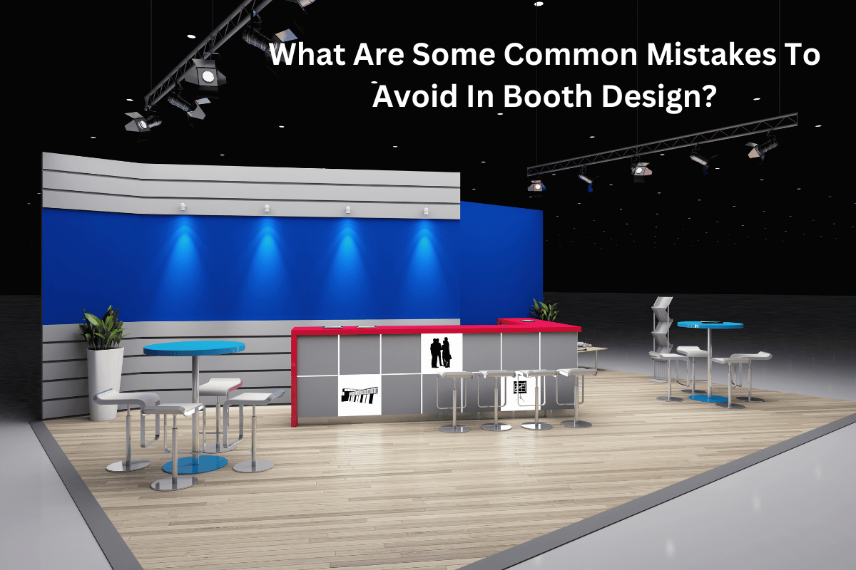
A cluttered or poorly organized booth can deter visitors and limit engagement. Ensure your booth layout is intuitive and allows for easy navigation. Create designated areas for product displays, interactive elements, and seating. Think about the visitor’s journey and how they will move through your space. A well-thought-out layout encourages visitors to explore and interact with your booth.

3. Ignoring Brand Consistency
Consistency in branding is crucial for creating a cohesive and professional appearance. Your booth design should reflect your brand’s identity, including colors, logos, and overall style. Inconsistent branding can confuse visitors and dilute your brand’s message. Ensure all booth elements, from signage to promotional materials, align with your brand guidelines.
4. Overloading with Information
While providing information about your products or services is essential, overwhelming visitors with too much text can be counterproductive. Keep your messaging concise and impactful. Use bullet points, infographics, and visuals to convey essential information quickly. Visitors should be able to understand what you offer within a few seconds of approaching your booth.
5. Neglecting Engagement Opportunities
A static booth with no interactive elements can fail to engage visitors. Incorporate interactive features like touch screens, product demonstrations, or virtual reality experiences to capture interest and encourage participation.
6. Inadequate Lighting
Lighting is crucial in highlighting critical areas of your booth and creating an inviting atmosphere. Insufficient or poorly placed lighting can make your booth appear dull and unappealing. Use a combination of ambient, accent, and task lighting to enhance the visual appeal and draw attention to important displays. Well-lit booths are more likely to attract and retain visitors.
7. Overlooking Comfort and Hospitality
Trade shows can be exhausting for attendees. Providing comfortable seating and refreshments can encourage visitors to spend more time at your booth. A welcoming environment enhances the visitor experience and offers more opportunities for meaningful interactions. Consider offering charging stations, water, or snacks to make your booth a relaxing haven in a busy trade show environment.
Avoiding these common mistakes can significantly improve the effectiveness of your booth design, helping you attract more visitors and achieve your trade show goals. A well-designed booth with clear objectives, thoughtful layout, consistent branding, concise information, engaging features, proper lighting, and a hospitable environment can set you apart from the competition. Partnering with a professional trade show booth exhibit company specializing in custom trade show booth design can provide the expertise needed to create stunning exhibits that leave a lasting impact.


