Color Psychology in Marketing
You may think that the colors used in marketing don't really matter, that they're just there for aesthetic purposes. But what if I told you that colors have the power to influence your emotions and behavior, and ultimately impact your purchasing decisions?
Color psychology in marketing is a fascinating field that explores the ways in which different colors evoke specific feelings and associations, and how businesses can strategically use this knowledge to connect with their target audience on a deeper level.
So, if you're curious to discover how the right choice of colors can make or break a marketing campaign, keep on reading…
Key Takeaways
- Red is a powerful color in marketing that compels consumers to take action and increases brand recognition. It is associated with strong emotions such as passion, excitement, and urgency, and incorporating red into advertisements significantly increases consumer response rates.
- Blue is a preferred color among both men and women and evokes feelings of peace, trust, and reliability. It can influence purchasing decisions by making consumers perceive a brand as trustworthy. Incorporating blue into marketing materials creates a sense of calm and reliability.
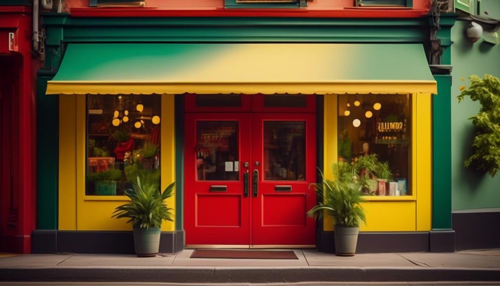
- Yellow grabs attention, evokes positive emotions, and stimulates feelings of happiness, optimism, and enthusiasm. It effectively grabs attention in marketing materials and has a significant impact on customer behavior. Using yellow can create a sense of positivity and optimism in marketing efforts.
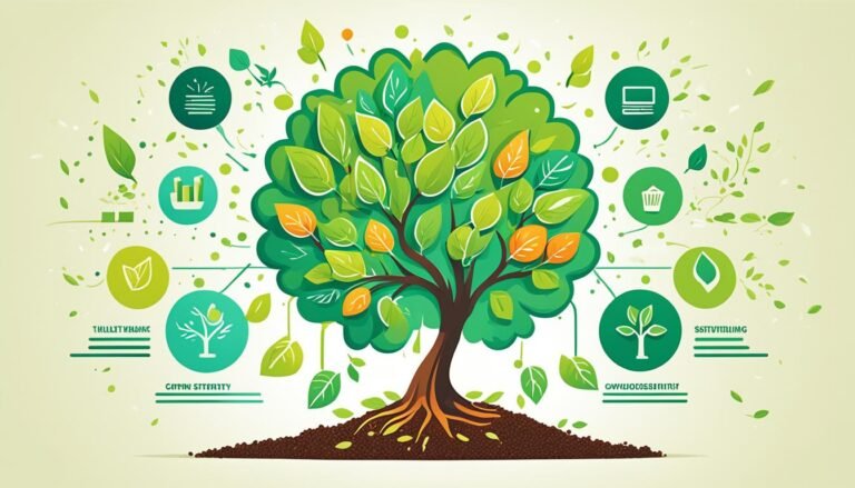
- Green is associated with growth, harmony, and reliability. It conveys a message of trust and credibility, particularly when used in logos, website design, and product packaging. Green attracts more loyal customers and enhances trust in the brand.
- Purple is associated with creativity, inspiration, and imagination. Exposure to purple enhances problem-solving skills and stimulates innovative thinking. Using purple in marketing materials creates an emotional connection with the audience and sets the brand apart, inspiring creativity.
- Orange captivates and engages consumers, evoking positive emotions and stimulating enthusiasm. Black has a mysterious allure and is associated with elegance, power, and luxury. It conveys sophistication and boosts perceived brand value.
- Pink exudes optimism and positivity, catching the eye and creating a sense of uniqueness. It appeals to younger demographics and can increase brand likability and customer loyalty. White is associated with cleanliness, simplicity, and minimalism, instilling trust and creating a clean aesthetic.
- Neutral colors offer a versatile palette for marketing strategies, blending seamlessly with other colors and providing a sophisticated and timeless look. They have universal appeal, resonate with a wide range of consumers, and create a sense of inclusivity. Neutral tones in marketing materials help avoid biases and stereotypes associated with specific colors.
The Impact of Red in Marketing
The color red has a profound impact on the success of marketing campaigns, compelling consumers to take action and increasing brand recognition. Its influence on consumer behavior is undeniable, making it a powerful tool for marketers looking to create a lasting impression.
Red is often associated with strong emotions such as passion, excitement, and urgency. This symbolism of red is consistent across different cultures, making it a universally understood color that can elicit a strong response from consumers.
In marketing, the color red is commonly used to grab attention and create a sense of urgency. It's often associated with sales and promotions, as it has been proven to increase the likelihood of impulse purchases. Studies have shown that when red is incorporated into advertisements, it can significantly increase consumer response rates. This is because red is often associated with importance and urgency, making consumers feel as though they need to act quickly in order to not miss out.
Furthermore, the symbolism of red in different cultures plays a significant role in marketing. In Western cultures, red is often associated with love and passion, making it a popular choice for industries such as cosmetics and romance. In Asian cultures, red is seen as a symbol of luck and prosperity, making it a common choice for businesses looking to attract customers in these markets.
The Calming Effects of Blue
After exploring the impact of red in marketing, it's important to understand the significant calming effects that the color blue can have on consumer behavior. Blue is often associated with feelings of peace, tranquility, and relaxation. This psychological impact of blue can be leveraged by marketers to create a sense of calmness and trust in their products or services.
Studies have shown that blue evokes a sense of trust and reliability in consumers. It's often associated with qualities such as dependability, loyalty, and honesty. This association is deeply rooted in our subconscious minds and can influence our purchasing decisions. When consumers see the color blue, they're more likely to perceive a brand or product as trustworthy and reliable.
In fact, research has found that blue is the most preferred color among both men and women. It's universally appealing and has a positive impact on our emotions and overall well-being. Incorporating blue into marketing materials, such as logos, websites, and advertisements, can create a sense of calm and reliability, making consumers more receptive to the message being conveyed.
Harnessing the Power of Yellow
Yellow is a powerful color choice when it comes to branding. It has been shown to grab attention and evoke positive emotions in consumers.
Incorporating yellow into your marketing materials can help create a sense of energy and optimism, making your brand memorable and appealing to potential customers.
Yellow in Branding
Harnessing the power of this vibrant hue, brands strategically incorporate the color yellow into their branding to evoke a sense of optimism and grab consumers' attention. Yellow is a color that's often associated with energy, warmth, and happiness, making it an ideal choice for brands looking to create a positive and memorable impression.
Here are three ways in which yellow can be effectively used in branding:
- Yellow in fashion: Fashion brands often use yellow to create eye-catching designs that stand out from the crowd. Whether it's a bold yellow dress or a pair of vibrant yellow sneakers, adding this color to clothing and accessories can instantly draw attention and make a statement.
- Yellow in home decor: Yellow is a popular choice for home decor because it can brighten up any space and create a warm and inviting atmosphere. From yellow accent walls to yellow throw pillows and accessories, incorporating this color into home decor can add a touch of energy and cheerfulness to any room.
- Yellow in logo design: Many successful brands incorporate yellow into their logos to create a visually appealing and memorable image. Brands like McDonald's and Best Buy use yellow in their logos to convey a sense of excitement and happiness, making their products and services more appealing to consumers.
Yellow and Attention
By incorporating the vibrant color yellow into your branding, you can effectively capture consumers' attention and harness its powerful ability to draw them in. Yellow is a color that evokes strong emotions and has a significant impact on customer behavior.
Research shows that yellow can stimulate feelings of happiness, optimism, and enthusiasm in people. These positive emotions can greatly influence their decision-making process and make them more likely to engage with your brand.
Studies have also found that yellow can increase attention span and improve memory retention. When used strategically in your marketing materials, such as logos, website design, and advertisements, yellow can effectively grab attention and create a lasting impression on your target audience.
Yellow for Positivity
With its ability to elicit positive emotions and influence customer behavior, the vibrant color yellow can be harnessed to create a sense of positivity and optimism in your marketing efforts. Incorporating yellow into your brand's visual identity can have a profound impact on how your customers perceive your products or services.
Here are three reasons why yellow is the perfect color choice for promoting happiness and well-being:
- Color symbolism: Yellow is often associated with sunshine, warmth, and joy. It's a color that symbolizes energy and optimism, making it ideal for creating a positive brand image.
- Attention-grabbing: Yellow is a highly visible color that easily catches the eye. By incorporating yellow into your marketing materials, you can attract attention and stand out from the competition.
- Emotional connection: Research shows that yellow can stimulate feelings of happiness and positivity. When customers associate your brand with these positive emotions, they're more likely to feel a sense of well-being and be motivated to engage with your products or services.
Harness the power of yellow in your marketing efforts to create a positive and optimistic brand image that resonates with your target audience.
Creating Trust With Green
The color green can be a powerful tool in establishing trust with consumers, as it's associated with feelings of growth, harmony, and reliability. When it comes to building credibility and instilling confidence in your brand, incorporating green into your marketing strategy can make a significant impact.
Research has shown that green is often associated with nature, which brings about a sense of calmness and stability. This connection to the natural world can subconsciously create an impression of reliability and trustworthiness in consumers. In fact, a study conducted by the University of Michigan found that participants perceived businesses with green logos as more trustworthy compared to those with logos in other colors.
Furthermore, green is also linked to growth and renewal. By utilizing this color in your marketing materials, you can convey a message of progress and positivity. This can give consumers the assurance that your brand is moving forward and continuously improving, which can further enhance their trust in your products or services.
Incorporating green into your marketing efforts can be done through various means, such as using it in your logo, website design, or even in your product packaging. By strategically leveraging the power of green, you can create a visual identity that exudes trustworthiness and reliability, ultimately strengthening your brand's reputation and attracting more loyal customers.
Enhancing Creativity With Purple
Purple has long been associated with creativity and inspiration. Its deep hue evokes a sense of mystery and spirituality, stimulating the imagination and encouraging innovative thinking. Research has shown that exposure to the color purple can enhance problem-solving skills and promote out-of-the-box thinking.
Incorporating purple into your marketing materials or workspace can stimulate creativity and inspire fresh ideas, making it a powerful tool for enhancing innovation and originality.
Purple and Inspiration
Using purple in your marketing materials can significantly enhance creativity and inspire your target audience. Purple has long been associated with spirituality and luxury, making it a powerful color choice for brands looking to evoke a sense of inspiration and aspiration.
Here are three ways in which purple can enhance creativity and inspire your audience:
- Symbolism: Purple is often associated with creativity, imagination, and spirituality. By incorporating purple into your marketing materials, you can tap into these symbolic meanings and create a sense of inspiration and motivation among your target audience.
- Emotional connection: Purple has a unique ability to evoke emotions such as passion, excitement, and inspiration. By using purple in your marketing materials, you can create a strong emotional connection with your audience, which can lead to increased creativity and motivation.
- Differentiation: Purple is a less commonly used color in marketing materials compared to more traditional colors like blue or red. By using purple, you can set your brand apart from competitors, creating a sense of uniqueness and exclusivity that can inspire your audience to think outside the box and embrace their creativity.
Purple and Imagination
By incorporating the color purple into your marketing materials, you can unlock the imaginative potential of your audience and enhance their creativity.
Purple has long been associated with imagination and creativity, making it a powerful tool in marketing. The psychology of purple suggests that it stimulates the mind and encourages innovative thinking.
When people see the color purple, it activates the part of the brain responsible for imagination and artistic expression. This can lead to increased creativity and problem-solving skills. Studies have shown that purple can inspire people to think outside the box and come up with unique ideas.
By using purple in your marketing materials, you're tapping into this psychological connection and creating a space for imagination and creativity to thrive.
The Energy of Orange
With its vibrant and energetic nature, orange has the power to captivate and engage consumers, making it a strategic color choice in marketing campaigns. The warmth of orange evokes positive emotions and stimulates enthusiasm, which can be highly effective in grabbing attention and creating a memorable brand experience. When used in branding, orange can convey a sense of energy, excitement, and creativity.
Here are three reasons why orange is a valuable tool in marketing:
- Stand out from the competition: In a sea of bland and forgettable branding, orange can make your brand pop. Its bold and eye-catching nature helps your business stand out from competitors and grab the attention of potential customers. Orange is a color that demands to be noticed, making it a powerful tool for creating brand recognition.
- Create a sense of urgency: Orange is often associated with urgency and immediate action. It stimulates the appetite and is commonly used in the food industry to elicit a sense of hunger. Incorporating orange in marketing materials can create a sense of urgency and prompt customers to take immediate action, such as making a purchase or signing up for a service.
- Appeal to a youthful audience: Orange is often associated with youthfulness, energy, and adventure. By incorporating orange into your marketing campaigns, you can appeal to a younger demographic who are more likely to respond positively to vibrant and dynamic visuals. This can help your brand resonate with a youthful audience and build brand loyalty among the next generation of consumers.
The Sophistication of Black
Black has a mysterious allure that captivates and intrigues consumers. Its association with elegance and power makes it a sophisticated choice for marketing. Studies have shown that black is often perceived as a symbol of luxury and exclusivity, making it an effective color when targeting high-end clientele.
Incorporating black in your marketing materials can help convey a sense of sophistication and sophistication, ultimately boosting the perceived value of your brand.
Mysterious Allure of Black
The enigmatic allure of the color black has long been associated with sophistication and elegance in the world of marketing. Its mysterious symbolism and psychological impact make it a powerful tool for brands seeking to exude a sense of luxury and exclusivity.
Here are three reasons why black is the go-to choice for creating a sophisticated brand image:
- Authority and Power: Black is often associated with authority and power, giving brands a sense of control and expertise in their respective industries. It conveys a level of confidence that can make consumers trust and respect a brand.
- Timelessness and Versatility: Black has a timeless appeal that transcends trends and seasons. It can be effortlessly paired with any color, making it a versatile choice for branding materials. This adaptability ensures that a brand can maintain a consistent and sophisticated image across various marketing channels.
- Minimalism and Simplicity: Black is inherently minimalistic and simple, which aligns with the current consumer preference for clean and streamlined designs. By embracing black in their branding, companies can communicate a sense of sophistication and elegance without overwhelming their audience.
Elegance and Power
As we explore the sophistication of black, its association with authority and power becomes even more apparent, reinforcing its role as a powerful tool in marketing.
Black exudes elegance and power, making it a popular choice in fashion trends and interior design. In the world of fashion, black is often associated with luxury brands and high-end products. It's a color that effortlessly conveys sophistication and class.
Interior designers also recognize the impact of black in creating a sense of elegance and power within a space. Black accents, whether through furniture or accessories, can add a touch of glamour and refinement to any room.
The Optimism of Pink
Pink exudes a sense of optimism and positivity, making it a powerful tool in marketing to harness the attention and emotions of consumers. The psychological effects of pink have been extensively studied, and the findings reveal its potential to evoke feelings of happiness and optimism.
Here are three reasons why incorporating pink into your marketing strategy can be advantageous:
- Stand out from the crowd: In a sea of bold and vibrant colors, pink can be a refreshing change that catches the eye. Its soft and feminine nature can create a sense of uniqueness and individuality, allowing your brand to differentiate itself from competitors.
- Create a positive association: Pink is often associated with femininity, love, and compassion. By using pink in your marketing materials, you can tap into these associations and evoke positive emotions in your target audience. This can lead to increased brand likability and customer loyalty.
- Convey a youthful and energetic image: Pink is often perceived as a youthful and playful color. Incorporating it into your marketing can help create an image of energy and vibrancy, appealing to younger demographics. This can be particularly beneficial for brands targeting millennials and Gen Z consumers.
Using White for Simplicity and Purity
To continue exploring the impact of colors in marketing, let's now turn our attention to the utilization of white to convey simplicity and purity.
White is often associated with cleanliness, innocence, and minimalism. When used strategically in marketing, it can evoke a sense of clarity and simplicity that attracts consumers.
One of the main reasons white is chosen for branding is its association with purity. White is often used in industries such as healthcare, beauty, and technology to convey a sense of cleanliness and hygiene. For example, many hospitals and healthcare providers use white in their logos and branding to instill trust and the perception of a sterile environment.
In addition to purity, white is also associated with minimalism. In today's fast-paced world, consumers are drawn to simplicity and minimalistic designs. White can create a clean and uncluttered aesthetic that appeals to these preferences. Think of the sleek and minimalistic designs of brands like Apple or Ikea, which use white extensively in their branding to convey a sense of simplicity and elegance.
The symbolism in color choice is a powerful tool in marketing. When used strategically, white can evoke emotions of simplicity, purity, and minimalism. By incorporating white into your branding and marketing materials, you can create a visual identity that resonates with consumers seeking a clean and uncluttered experience.
The Versatility of Neutral Colors
Neutral colors offer a versatile palette that can be utilized in various marketing strategies to appeal to a wide range of consumers. The neutrality of these colors allows them to blend seamlessly with other colors and create a balanced and harmonious visual experience.
Here are three ways in which the versatility of neutral colors can be harnessed in marketing:
- Branding: Neutral colors can be used as a foundation for brand identity, providing a sophisticated and timeless look. By incorporating neutral tones such as beige, gray, or taupe in logos, packaging, and marketing materials, brands can convey a sense of reliability, professionalism, and elegance. These colors also allow the brand's message and products to take center stage.
- Product Presentation: When it comes to showcasing products, neutral colors can serve as a backdrop that enhances the overall appeal. By using neutral backgrounds or packaging, companies can create a clean and uncluttered visual environment that allows the product to shine. This approach is particularly effective for industries such as cosmetics, fashion, and home decor, where the focus should be on the product itself.
- Targeting Diverse Audiences: Neutral colors have a universal appeal and can resonate with a wide range of consumers. By incorporating neutral tones in marketing materials, companies can create a sense of inclusivity and cater to diverse demographics. Moreover, neutral colors can help avoid potential biases or stereotypes associated with specific colors, ensuring that the brand's message reaches a broader audience.
Conclusion
In conclusion, the strategic use of color in marketing can greatly influence consumer behavior. By harnessing the power of red, blue, yellow, green, purple, black, pink, white, and neutral colors, marketers can evoke specific emotions and create a desired response from their target audience.
This data-driven approach allows businesses to effectively communicate their brand message and build trust with consumers. So, next time you're designing your marketing materials, remember the impact that color psychology can have on your success.